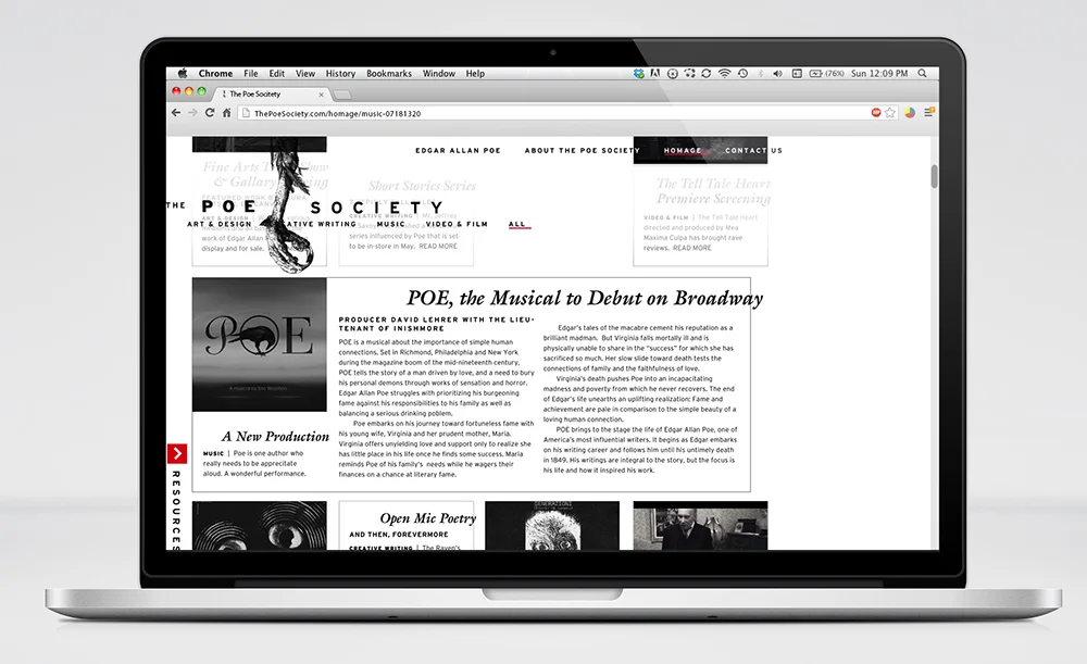
The Poe Society Rebrand & Website
The Poe Society comes from the joining of Poe International and the Edgar Allen Poe Society of Baltimore. The two have hypothetically decided to join together as a more simple The Poe Society.
Between the two, a healthy cultivation of literature, events, and fan-art has been collected. I have created a logo system with the raven’s claw as the primary mark. Other marks are made with objects focused on in some of Poe’s slightly lesser known works; to a Poe fan, they will be immediately recognizable.
In all of the collateral, a sense of general uneasiness was sought. Though I know the border typography will be a tricky bit of production, it is something that I feel I would personally over-see the production of. It can all be printed entirely black and white, and on uncoated stock. Business cards have a solid black core.
A matchbook-style desk calendar would be part of a membership kit. The cover is printed in black ink on black stock creating a very subtle presence. The pages are perforated each at a different height and angle so that the lower edges are left behind.
Much of the inspiration for the collateral came from the development of the website. This is because the main way members would interface with the organization would be through the web.
This is hardly like any other literary website, but I think most will agree that Poe's writing is unlike any other author. You'll notice that the logo, main navigation, and resources tab remained fixed in position on the screen. As the user scrolls, content moves under them; you can see how this might work in the fourth image.


